Designing Faster Payment Experiences
VoPay
VoPay is a Canadian fintech company that provides embedded payment solutions, enabling businesses to automate payouts, bank transfers, and payment processing through a unified platform.
As part of the interview process, I completed a product design challenge focused on improving a core payment workflow, creating a more intuitive and user-friendly experience while addressing business and usability goals.
Client
Fintech
Duration
1 day
Team
Solo Project
Scope of work
End-to-End Design
Web App Design
Product Design
Competitive Analysis
UIUX Design
Wireframing
Prototyping
I was given a product design challenge as part of the interview process, with less than 24 hours to complete both the redesign and prepare presentation slides, requiring fast problem-solving, clear design thinking, and strong prioritization under time constraints.

Customer support was receiving 40% more tickets for cross‑border payments compared to domestic transactions, which indicated that users were not getting the clarity they needed from the product experience. Users struggled to understand what happens after submitting a payment, how fees are applied, and when funds will be delivered.
In this design challenge, I took end‑to‑end ownership of the design track and its coordination with product and engineering. My responsibilities included: scoping the solution into MVP and Phase 2, planning the timeline, aligning stakeholders (Support, Product, Sales), and collaborating with two part‑time frontend developers to ensure feasible delivery within 2.5 weeks.

The challenge was intentionally scoped to mirror realistic delivery conditions.
These constraints guided my decisions around scope, level of fidelity, and how to collaborate effectively with product and engineering.
Limited Timeline
1 week for design, 1.5 weeks for development
Small Team
2 part‑time frontend developer
Limited Access
Limited direct access to end users due to typical B2B constraints.
I used a structured, end‑to‑end design process tailored to the compressed timeline and technical constraints.
I formalized a simple project plan aligned with the fixed timeline and limited dev capacity.
Key notes:
● Use existing UI components where possible
● Break into MVP scope (basic confirmation + basic status)
● Phase 2: full progress bar and notifications
Week
Tasks
Notes
Week 3.5
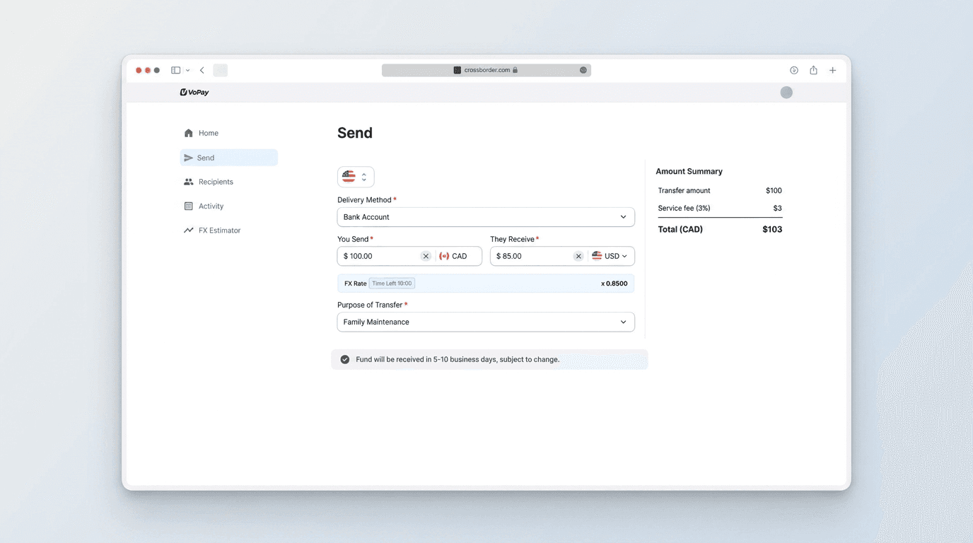
I redesigned the cross-border payment experience to improve transparency and reduce user uncertainty by introducing clearer fee breakdowns, payment status updates, and post-payment feedback. The solution prioritized an MVP approach that balanced user needs with technical feasibility.


How I'd Measure Success
The redesign would be evaluated through a mix of support volume, task clarity, user confidence, feature engagement, and transaction completion.
Reduction in cross-border payment inquiries related to fees, payment status, and delivery timelines.
Percentage of users who can correctly identify payment fees and expected delivery time before submitting a transaction.
Improvement in post-transaction satisfaction through surveys or CSAT.
Usage of payment status tracking and transaction details.
Higher completion rate for cross-border payments and fewer abandoned transactions.
Project Evaluation
• Prioritizing Impact Over Scope
Working within a constrained timeline reinforced the importance of identifying the highest-impact opportunities first. Rather than redesigning the entire payment experience, I focused on moments that directly influence user trust—fee transparency, payment status, and delivery expectations.
• Balancing User Needs with Technical Feasibility
Effective product design isn't just about creating the ideal experience; it's about delivering solutions that can realistically be built. By aligning the design with an MVP approach and existing UI components, I ensured the proposal balanced user value with engineering constraints.
• Designing for Trust for Fintech product
Cross-border payments involve uncertainty, making clear communication as important as the transaction itself. This project reinforced how thoughtful feedback, transparent information, and well-timed status updates can increase user confidence without adding unnecessary complexity.