Modern Tree Publishing

Project Overview
Modern Tree is a mock novel publishing house. The goal of this project is to design a business card, logo, letterhead and a branding book for a new company.
Project Goals:
To have a better understanding of colour harmonies by choosing the colour schemes of the logo, and to obtain the abilities of picking the right typographic and typeface in order to match the theme of a certain company.
To design branding deliverables for Modern Tree Publishing:
-
Establish a Distinct Brand Identity: Create a memorable and visually appealing logo and branding system that reflects Modern Tree’s values and mission.
-
Ensure Brand Consistency: Develop a cohesive visual identity, including typography, color palette, and supporting design elements, to maintain a unified look across all touchpoints.
-
Appeal to Target Audience: Design a brand aesthetic that resonates with Modern Tree’s target demographic, ensuring relevance and engagement.
-
Enhance Brand Recognition: Deliver a logo and branding assets that are distinctive and versatile, enabling Modern Tree to stand out in a competitive market.
Client
School Project: Modern Tree Publishing
Team
Designer Karen Jeong
My role
I took the lead on conceptualizing and designing the logo and visual identity for Modern Tree. My responsibilities included conducting market research, brainstorming creative concepts, and developing a cohesive brand style guide. I also collaborated closely with my teammate to refine design elements and ensure consistency across all branding assets.
Duration
five-week school project from graphic design class in 2015.

Mind Map
Firstly, my partner and I chose to design for a book publishing company, then we drew out a mind map of a book publishing company by writing down the keywords that are related to book publishing company, which is shown in figure 1.

Figure 1. Zhang, J. Jeong, K. (Dec 2015). Mind Map.
Visual Research
After choosing the category of the company, I did the research of this type of company and my group member Karen drew out the logo and name of the existing publishing companies, which is shown in figure 2.

Figure 2. Zhang, J. Jeong, K. (Dec 2015). Visual Research.
Iterations
Then I designed a new logo using the pen tool in Illustrator with my partner to trace the image (figure 3). After trying different colour harmonies, we decided to use monochromatic harmonies of pink which matched the personality of the company.


The Challenges
After designing the logo by illustrator, we got the feedback from the TA that we need to improve the logo (figure 7) by reducing the detailed of it. Due to the fact that we were using the pen tool from Illustrator to draw the logo based on the one we found online, which contained lots of detailed of the leaves on the tree, it made our logo too complicated and hard to be memorized by the target audiences. For these reasons, we refined the edges of the logo and design the final logo with less details (figure 8) and alternative B&W logo (figure 9).

Brand Personalities
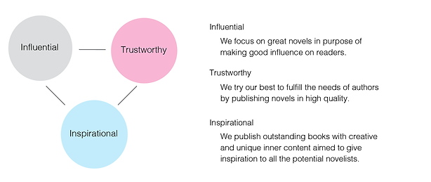
Our company is an experienced and matured novel publishing house in Vancouver. We understand the needs of authors and has maintained great reputations as we become the top choice of the novelists. We aim to publish the best quality books and become the most reliable novel publishing house.


CREATED BY JAMIE ZHANG
Design & Space
Our logo is made up of two elements: tree icon and “Modern Tree Publishing” wordmark set in Book Antiqua. Some white space around the border of the logo is required.

Color Palette
Pink is our primary color. It represents trustworthy and gives a warm feeling to the novelists as we care about our clients and prioritize their needs. Grey on the wordmark of the logo enhances the influences we aim to bring readers. Blue could be used on print or web on the content to evoke feelings of inspiration and communication.

The logo has done in monochromatic harmonies with color pink and white to represent simplicity and clarity in our brand.
MONOCHROMATIC


Logotype
The combination of two fonts in the logotype creates a modern and elegant feel to the novelists. In the font American typewriter, the serif on the letter gives a high readability and formal feelings in the “Modern Tree“ wordmark. The word “Publishing” deals with introduction matters, aims to provide an explanation to the brand and logo so it uses Book Antiqua as a font for clear visibility.
Project Evaluation
This project helps me develop a better understanding of the colour harmonies and obtain the abilities of picking the accurate typographic, typeface and spacing by doing the kerning on each letter. After the project, I realized the importance of each choice of font and colour for a company, either the colour represents its environmentally friendly or its modernism, and the font either illustrates its playfulness or seriousness.